December 2016

Personal Water Bottle

The prompt: Give an everyday carry piece—a water bottle—an iconic personal flair.

The product: A custom one-off water bottle print that remains high quality and in active use today.

Project statistics

  • Timeframe: 1 month
  • General role: Illustrator

Software utilized

Adobe Illustrator
  • Final assembly of graphics onto company provided templates catering to unconventional printing solutions.
Adobe Photoshop
  • Controlling files to be print ready for unconventional printing procedures.
  • Creation of digital based illustrations from sketching to final detailing.

Skillsets emphasized

Illustration
  • Creation of digital based illustrations from sketching to final detailing optimized for the medium's benefits and drawbacks.
  • Illustrating similar characters with a consistent and artistic style.
Graphic design
  • Optimizing color choices for most visually consistent output in a CMYK system with product specific accommodations.
  • Utilizing industry standard color systems (ie. Pantone) whenever reasonably possible to maximize visual consistency.
  • Assembling graphics on company provided templates to maximize final quality.
Project management
  • Basic file management.
  • Collaboration with providing company regarding unlisted/custom products, product graphic templates, and best practices.
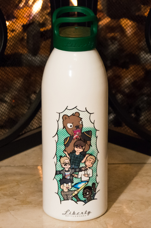
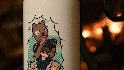
Water bottle front, circa. December 2016. The designs themselves remain unscratched to this day, somehow narrowly missing each and every ding and scrape that would happen later on.

I prefer to use a reusable water bottle than be locked into buying plastic ones. I prefer to leave my mark on what's mine when the piece allows it. It wasn't too big of a jump to put one and one together. All it took to get to a custom water bottle was thinking a little too hard about sharpies and stickers.

I got a Liberty Bottleworks bottle around October 2016. We were mainly a plastic reusable bottle house, but there were some intersecting reasons towards why I wanted to try a switch. Nalgenes typically had a habit in our house of somehow vanishing as they'd go to camping trips and seemingly never come back. I decided to take my most recent loss of a nalgene as an opportunity to switch over to a stainless steel bottle. The clear plastic on nalgenes wasn't a welcoming backdrop for sharpie work, either. In comparison, a white paint body would give me a better canvas to personalize it. I had my first sheet of personal logo stickers coming in around that month too, and the white backdrop would complement them just as well as it would complement sharpie. Some brand research lead me to consider that Liberty Bottleworks would line up the most with what I valued, so a Liberty bottle it was.

The first water bottle. While no longer in active use, it remains around as a keepsake.

Decorating this first bottle was pretty straightforward. A ring of stickers below the top arc and some dot patterning to fill in the space looked plenty pretty for me. If I recall correctly, it was a fairly quick project fulfilled over multiple idle bits of class time, albeit expiring more than one green sharpie. In all, it was a project that gave quick results.

The problem was that these quick results were quick to give out. Condensation, let alone a proper wash, would remove all but a trace of the dots. A cool bottle on a hot day would leave my hand smeared in sharpie green. The stickers still held fast, but I started to wonder if they'll continue to hold fast. In all, I think I lasted about less than a week with that bottle as it was before I decided this would not do. If I was going to have a personalized water bottle, it'll have to be personalized from a factory setting.


I don't recall if customization was a criteria in selecting Liberty, but if it wasn't, I was fortunate enough then to discover they offered bottle personalizing my bottle form. I found one problem though: the editing space on their online customizer was small. Quite small for my taste. I recall having a small canvas to work with and even smaller constraints for the elements inside. A 300x300 pixel maximum size for placed images? No thanks. The thing was that I saw they had bottles with full wrap prints around the entire bottle. It was certainly possible from a technical standpoint. It wasn't an advertised option on their site, but I figured that if it was possible to do, it was worth asking. Would they provide an independent designer with the specs to do it, and would they be willing and able to do a one-off print?

After some consultation and patience over an email discussion, it turns out the answer to both of those was yes.

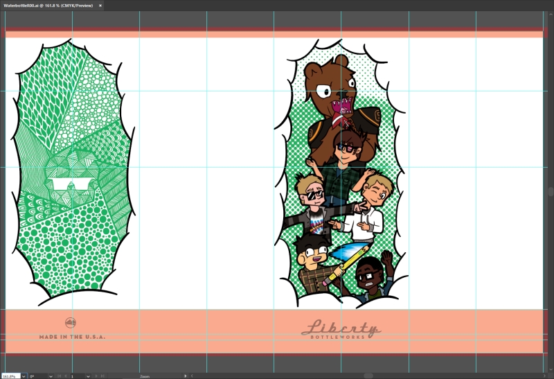
The final water bottle artwork, as shown in the bottle template circa. 2016.

Awesome! Now I needed to figure out what to put on there and how to do it. Yet as it often goes, this was the hard part.

Reading up on their suggestions, I noticed that this may end up involving some extra considerations:

  • Prints should involve less than 65% ink coverage, which meant that while my canvas was greatly expanded, I was not quite out of the woods. I'd have to be considerate about how much space I took.
  • Prints should avoid gradients and light color changes; vectors and line work were preferable. At that point in time, I wasn't familiar with doing illustrations in vector. I knew it was possible but I figured it would make for too complicated for a job at the time. That meant doing doing my illustrations my usual way: through Photoshop. With a high res document, I figured that wouldn't be a big deal. I also decided to keep things simple and keep the maximum detailing at coloring layering. Light color changes meant that shading fidelity was at best shaky, and dealing with that wasn't on my mind. Speaking of light colors…
  • Prints were done with semi-transparent inks. Fortunately I didn't have a vibrant colored bottle to work against, but a pure white bottle didn't mean I was entirely in the clear. I needed to anticipate my colors being a hint desaturated and a hint lighter. In sum, I needed to compensate with more saturated colors when I could. On the flip-side…
  • Extra attention was requested regarding blacks. Blacks needed to be 100% K, grays a percentage thereof, and no grays lighter than 15%. Blacks with a color tone may get lost, and blacks that were 100% CMYK or an RGB equivalent were a no-go. This wasn't too hard to watch out for, but it was indeed one extra thing to consider.

And what about what to do for the piece itself? Perhaps I could play into the 65% ink guideline and do two different pieces on opposite sides. Play into the white paint like it's parting clouds to reveal two different frames. But what goes in each one? I thought a cartoon collage would play into the direction I thought my art was going: a lil' scene with me and some of my friends, shadowed my our high school mascot, all of which backed by an abstracted halftone rendering of Mt. Diablo. I figured it was a scene I could appreciate for the coming years. For the other side, I could do a zentangle looking fill. It was a look I liked doing for a few years then. I thought it would make for a nice contrast to the front side, and it also made for a nice opportunity to slide in the logo. Fidelity of the US Shades I was keen on at the time was lost, so they had to be removed—a bit of evidence that I knew they had it coming, I suppose. And hey, with all that, I had a custom bottle!

Final timelapse clip.

It's been eight years since I made the bottle. Am I still drinking from it? Well…

The artwork held up remarkably well. The whole outside held up remarkably well. The bottle shows no sign of outright giving in despite dealing with more than its fair share of falls and slams. The colors look about as they did when the bottle came home. The textured knockouts were a pleasant surprise and continue to be a nice tactile accent. 32oz is a solid size for a reusable bottle. Its profile is slim enough to fit in more pockets than I'd expect a Nalgene to. Little pebble like paint divets and shades of dirt show wear on surface contact points. A ring of bare metal goes around where the bottle is worn even further. There are at least two deep bumps where the bottle hit an edge or the ground hard. I know at least one of them comes from the bottle taking the brunt of force from my backpack being thrown across a small river on a Marine Bio trip.

No, the outside is holding up quite well. It's the inside.

They added some sort of coating on the inside that looks a lot like the same sort they put on the exterior. Over the years, it developed cracks and even flaked off on places well worn. On the interior bottom is a questionable crack or two in the paint, at least one of them with a bit that may or may not be sticking out which may or may not concern me. I also find myself questioning the chipped paint around the lip of the bottle where it makes contact with the bottle lid. It's likely fine, but I decided maybe it was time to retire the bottle from active service. It had been to high school and three college campuses, five foreign countries, as high as planes and as low as the Transbay Tube. As far as I was concerned, it earned its retirement.


And what can I say about the project looking back? When I was working on it then, their directly advertised customization options were slim. When I check out their site now, such pickings are even slimmer. End consumers seem limited to either a monogram based on several choices or a line or few of text. I like to have faith in the end consumer, but I suppose they got more than their fair share bluntly asking for too much or not having the know how to even do a 300px. .png right. I, too, likely would only be able to stomach so many of those before I start to question if it's worth it for most consumers. But the plain and simple fact is that there's plenty of consumers who know what they're doing and what they want, and it can be unfortunate to see things simplified in spite of these sorts. The interesting thing, however, is that it's not necessarily this way. Take the initiative to check in with someone on the other end and you might just realize there's more that's possible than what's directly mentioned. Sometimes there really is that extra something that's not shown in the counter. Sometimes there really is room for a unique position they didn't advertise before.

And yes, sometimes you really can do a custom job on the level that pros on site do. It's often worth asking.