April 2019

Hourglass

The prompt: Create a minimalist, design focused album cover.

The product: A product going beyond the initial, simplistic idea. A full digital and print service including combined tracklist images for social media, CD graphics, and jewelcase front and backside variants.

Project statistics

  • Timeframe: ~2 weeks
  • General role: Graphic designer
  • Client: Colin Judd

Software utilized

Adobe Lightroom (Classic)
  • Organizing and selecting choice photographs for use in designs.
  • Preparing digital RAW files for application in designs.
Adobe Photoshop
  • Creating raster-based designs ready for both digital and print application.
  • Preparing pieces to fit precise specifications in application.

Skillsets emphasized

Graphic design
  • Idea generation and execution.
  • Research and work within precise specifications for digital (eg. Spotify) and print (eg. jewelcase) application.
Photography
  • Natural photography for use in design.
  • Use of specialized digital RAW processing and developing software for precise control over asset characteristics.
Project management
  • Collaboration and digital product delivery with client.
  • Basic file management.
  • Invoicing and project pricing.
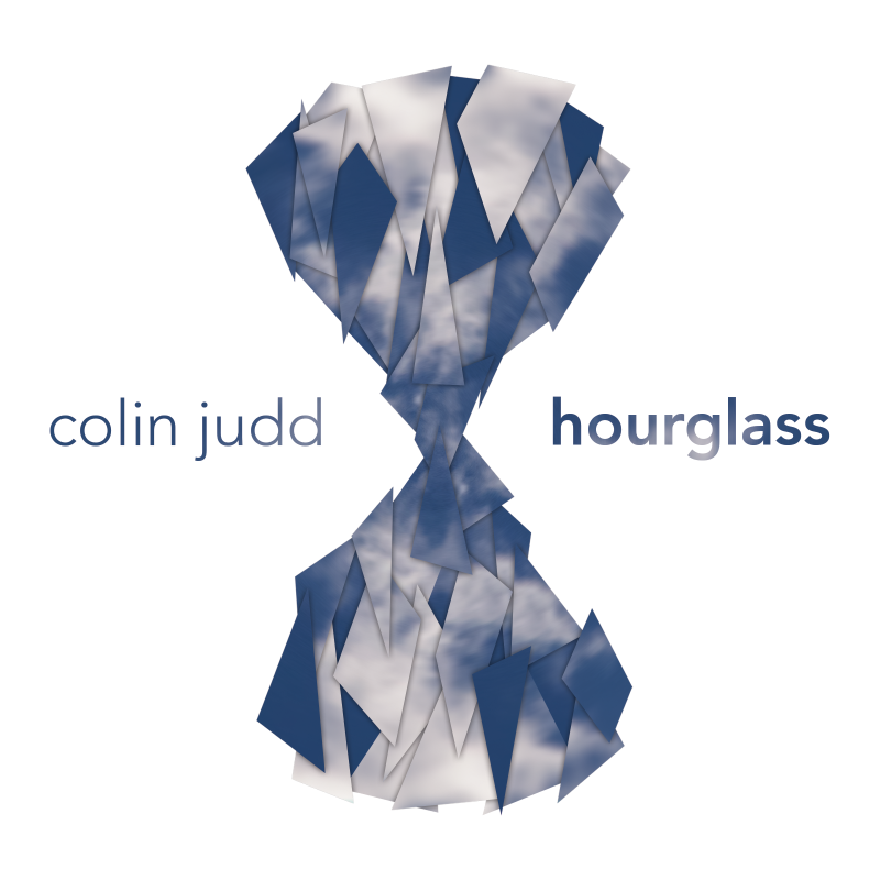
The final album cover.

Colin told me he wanted an album cover done over his Spring Break. I figured I could make it happen, so I told him to send me over some tracks to listen to and to tell me his current concepts of what he wanted.

It's great when the client is able to provide some detailed input in what they want, but sometimes there's going to be some leeway in what comes over. More often than not though, it can be tough to come up with a gameplan.

I knew what Colin wanted to call the album: Hourglass. I knew that his initial ideas had to do with "a basic drawing of an hourglass, with the sand draining and all that." Beyond that, it was left to me.

Giving the album a first impressions listen, I remember finding it distinctly classy and polished from his earlier albums. Between my first impressions, Colin's own thoughts, and my experience with his previous two albums, I knew I wanted this cover to be something different. This album was a refined piece above the others, and I felt a drive to ensure this album cover reflected that.

I think I looked towards artists like Cinematic Orchestra for my cover inspiration, especially for this one. I wanted the cover to be sleek and modern, but I wanted to let the music do the talking; the sort of piece that someone could look at and project their own meaning into. I wanted to go with Colin's idea of going with the hourglass, but I also wanted to make the figure fairly abstract. Fragmented, perhaps.

"Fragmented." When that word popped into my mind, I found myself latching onto it. What if I built the cover's figure out of fragmented shards? Like a broken glass, haphazardly put back together?

From there, it only took me a few days to create what I consider to be the best of my album covers for Colin.


In my experience, a project is only as good as the ideas behind it. It's the idea behind this album cover that I think makes it so great rather than its execution. A mediocre idea designed by the best designers is only going to go so far. Some of the other album covers I made for Colin weren't as spectacular, and looking back, this project emphasizes for me why. I made all of my covers for Colin progressively more equipped with design skills and knowledge, but it was only Turning Points and Hourglass that felt like genuinely creative ideas to me.

It goes to show that in design, the most important work isn't what happens towards the end. It's what happens towards the start.