May 2017

Library Signage

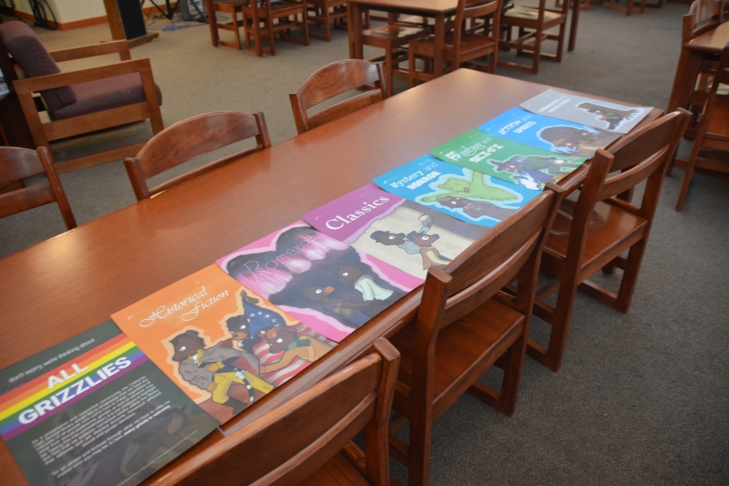
The prompt: Provide the high school library with posters for the bookshelf ends on their genre shelves.

The product: A collaborative full service with a total of eight posters, all of which tied with meaningful theming related to the school.

Project statistics

  • Timeframe: 6 – 7 weeks
  • General role: Digital artist, Graphic designer
  • Client: California High School

Software utilized

Adobe Illustrator
  • Creating vector based elements for clean, scalable use in Photoshop.
Adobe Photoshop
  • Preparing files to be print ready and exported for printing in the shop.
  • Creating high resolution, tabloid sized posters from post-sketch linework to final lettering.

Skillsets emphasized

Illustration
  • Drafting element and poster concepts, with both physical and digital methods.
  • Adapting a sketchbook sized canvas to tabloid sizing with consistent aspect ratios.
  • Carrying out physical archiving best practices.
  • Creating high resolution, high fidelity digital illustrations, from initial linework to end shading and detailing.
  • Illustrating similar characters with a consistent and artistic style.
Graphic design
  • Creating a poster series with consistent theming and elements.
  • Utilizing industry standard color systems (ie. Pantone) whenever reasonably possible to ensure visual consistency.
  • Printing prepared files in a shop environment.
  • Trimming prints and preparing for delivery to the client.
Project management
  • Basic file management.
  • Thorough and thoughtful collaboration with the client or project work, from initialization to final touches.
  • Physical delivery of product to the client.
The Historical Fiction poster, as shown in the project's hero image. This was technically the first poster done for the series.

In my senior year of high school, I decided to take an AP Comp Sci class. At that point in time, I didn't think I would be getting into design. I was thinking I would get into computer science and help develop programs and the like.

I ended up dropping out of that class halfway through the school year.

I wholeheartedly respect that Computer Science is a tough field to adequately teach, but I found that class to not be for me. For a course covering a strictly digital material, it was incredibly jarring to be straddled between coding on one end and working out programs with pencil and paper on the other. At best the class felt like a slog to me. Was there a method in the madness? Sure there was, but in that point in my life, I didn't have enough time for that madness. At that point in the school year, my options of where to go were fairly thin. On a whim, I spoke with my Computer Graphic Arts professor from the year before to see if she had a TA position open for the period I suddenly freed up. It just so happened her TA for Digital Photography that period was going for a different class that semester. Worked just fine for me.

I took Digital Photography with a different professor the year before, but a lot of the help that was needed with the class wasn't too class specific anyway. If nothing else, I knew my way around the tools and methods enough to be serviceable at their level. Aside from especially advanced actions and the rare software goof that went over our heads however, the students seemed fairly well equipped for the material. There were times after the first onboarding to new material that I wouldn't be up to much. It was good to be useful to the class, but that wasn't what ended up being the bulk of my time in the class. Instead, the bulk of my time and efforts would be spent on design projects.

As the school's primary professor for digital art and design, a lot of relevant opportunities would come her way. Some of them were related to school and school events, others were competitions that prospecting students could participate in and be passed down to the class. I was happy to take on whatever she could pass to me. Projects I took on from my time in that class include posters and branding of a fundraiser event, an award winning graphic design entry in a district wide competition, the cover for the next year's school planner, the collecting and vectorization of various school brand assets, and the publishing of the school's first style guide. This ensemble of library posters was one of these projects.

The first concepts of the characters used in the poster series. I drew similar grizzly bears for personal projects related to the school before, so they were a natural choice I settled on quickly. Pay no heed to the broken shoulders.

Around late March, early April, my professor was approached by the school's head librarian. The library was going to establish genre specific bookshelves, and the librarian wanted to cap off each bookshelf end with a genre appropriate poster. I was put into service for the project and got to work establishing an idea.

If I recall correctly, I settled on the so-called "Grizzlies in Culture" theme fairly quickly. Grizzly Bears are the mascot of the school, and I had previous experiences drawing similar characters for personal projects that referenced the school. I figured that drawing some iconic scenes with these characters in my style could fit the bill nicely. It would have a casually fitting yet stylistically refined look that would fit well in a high school library as long lasting pieces. The connection with the school and between each poster was simple to make. Being characters, it was a simple matter of dress up to fit each one specifically for the genre at hand.

The sketchbook draft of the Historical Fiction poster. The proportions between a tabloid print and the sketchbook's 9 x 12 in. pages were slightly off, requiring some calculations and markup of the sketchbook pages for optimal drafting.

Historical Fiction struck me as an immediate first choice as a proof of concept for this series, and it remains my favorite of the bunch. It used an iconic scene that was easy to get straight away. Not too complex to be overwhelming, but detailed enough to make for an interesting illustration with a great impression of where the series can go. Considering that the head librarian approved the concept when I presented it to her about a week later, it seems like it was the best choice.

The final Romance genre poster. A Romeo and Juliet was first considered for this scene.

After the initial approval of the series concept, the rest of the posters came on easy: draft, receive librarian approval, complete, repeat. There were at least a couple of posters which, due to the nature of their content, warranted extra care and attention. Some elements were simple sign offs (yes, Doom bear's SMG met school appropriate guidelines,) whereas other elements we approached together more carefully to get it right. Calhigh served a diverse population. This was reflected from their faculty to the classroom, and it was only proper that it would continue to be reflected in the library. The library wanted to be inclusive of genders and sexual identities, and highlighting this with the genre posters was a desirable step. I was happy to oblige this interest and do my part.

For most of the posters, this was easy to fulfill: leave gender identifications as ambiguous as possible and leave room for interpretation. So long as the bears weren't given overtly identifying elements, I figured this was a non-issue that wouldn't need specialized accommodations. This made the obvious solution for the Romance poster impractical, however. For all that can be said about Romeo and Juliet, the relationship there is undeniably iconic—if not for its place in Western culture, than certainly because it was required reading for every student in the school. A scene from the play is something most students would likely pick up on. The issue is that such a scene would, by its nature, have to cast a Romeo and a Juliet. I brought up my concern with the head librarian and we agreed that this concept didn't leave enough room for interpretation. It would have to be scrapped.

Since inclusivity was an emphasized concern with this project, we decided to go with a two part solution. The Romance scene was changed for a generic one: two bears holding hands, looking into each other's eyes, standing under an aurora. It did not have the connection to culture I would've considered a 100% success for my personal specs, but it would communicate the genre just fine. Our second decision was to create one more poster explicitly mentioning our desire to be inclusive and what we were doing to help back that up. The library was host to an array of books concerning a diverse range of identities, and we wanted everyone to be aware they were here and they may be read. We wanted to draw attention to the idea that every Grizzly was welcome, and it was our hope that the measures we took would help emphasize that just a bit more.

The final lineup of all eight posters before lamination.

The project was completed right towards the tail end of the school year. That last month or so would turn out to be surprisingly busy, if at the least productive. An eight poster series, seven of which being particularly involved; a series of gift posters for favorite professors through the years, ten posters with nine being new; and the typical busywork and finals prep that comes with the end of an involved Senior school year. I remember it felt like a lot of work for me to take on then on top of my typical responsibilities. Looking through the metadata, there's certainly more than one piece with a last modified timestamp in the early hours of the morning. Considering how much work it felt like doing, I also remember having to take the work to spots and hours I didn't typically do. I recently got a 2-in-1 laptop with a pressure sensitive screen and stylus—the same laptop I still use today in fact as of writing this. Among the unusual work hours were points in Yearbook when we weren't busy distributing, the scores of fire alarm pulls that came with the time of year as "pranks," and down time during a weekend outing or two with the RV.

But despite how involved the projects felt or the hours and workspaces I ended up taking, I also remember feeling passionate for what I was doing. Looking back, the effort and hours I took on then versus the hours I took on for my AP Comp Sci class were fairly close. If anything, my effort and hours TA'ing for a Digital Photography class and working on its collateral took up more than AP CS could. But the difference was in what I ended up really wanting to do. I wasn't satisfied with my output in AP CS, and I felt stuck in a setting that was limiting. Half the time I couldn't see the fruit of my labors because it was scrawled on an exam sheet with pencil and paper, my feedback coming back in red penned chicken scratch. But when I switched out of the class and into my design work, it felt like I was in a special point in time. I was helping others achieve success in an area I was knowledgeable in. I was doing things for the school, ranging from short term events to foundational assets for future designers in my place. I was entering district competitions and winning them. I felt like I was serviceable, and it felt like I was acknowledged for it.

I remember idly musing that a career in arts or design was an option, but I'd dismiss it in favor of programming. A career in computer science struck me as a reliable money maker that I couldn't find in a creative field. But something about that semester had it click in my mind: design in fact has a very practical niche in society, and a paying one at that. With the passion I have for design, I have the opportunity to let my design work be a reliable money maker too. By the end of that semester, my focus shifted towards working towards a design based career. Touching base with my Computer Graphics teacher, I decided I'd work towards a degree in Visual Communications at SF State.

All things considered, taking that AP Comp Sci class was a smart move. As it sometimes goes, it wasn't smart for the reasons I was expecting, but for the reason I'd ultimately want.